Texts
How words look, breathe, and feel across every layout.
Title
A short description that supports the heading and sets context for the section below.
Mono typeface, extra-small size, bold weight, extreme letter-spacing, uppercase. Sets category context above the main heading.
font-mono · text-xs · font-bold · tracking-[0.3em] · uppercase · text-primary
Raleway Black at oversized scale with hollow stroke effect. The transparent fill with coloured outline creates a dramatic, editorial feel without visual heaviness.
font-heading · font-black · text-6xl / md:text-9xl
-webkit-text-stroke: 2px #1434EB
From concept to launch — full-stack creative solutions tailored to your vision.
Nunito at large body size, muted opacity. Constrained to max-width for comfortable line length. Provides supporting context without competing with the stroke title.
font-body · text-lg · text-corporate/50 · max-w-xl
The trio sits left-aligned with tight vertical gaps: 1 unit between eyebrow and title, 2 units between title and description, and 16–20 units of margin below before section content begins.
mb-1 · mb-2 · mb-16 md:mb-20
text-left · max-w-6xl · px-6 lg:px-8
Every great digital experience begins with words. Typography is not just about choosing fonts — it’s about creating rhythm, establishing hierarchy, and guiding the reader’s eye through content with intention and grace.
Good typography respects the reader. It gives space where space is needed, emphasises what matters, and recedes when the content should speak for itself. On the Amalfi Coast, we understand beauty in restraint.

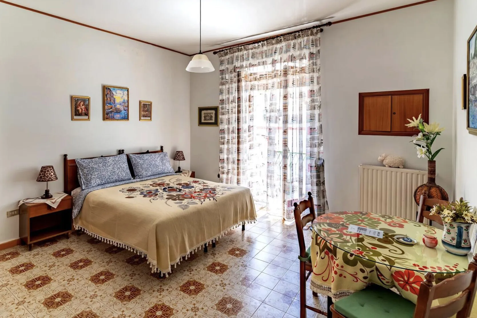
Where image meets narrative
Pairing visuals with copy creates a dialogue between what the eye sees and what the mind reads. The image anchors emotion; the text provides meaning.
This layout works beautifully for case studies, feature highlights, and editorial storytelling — anywhere the visual and verbal need equal weight.
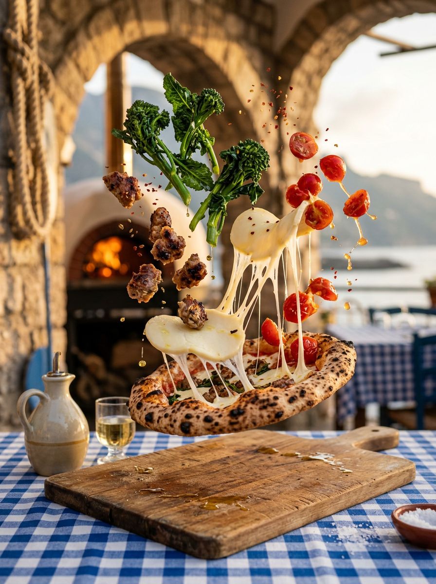
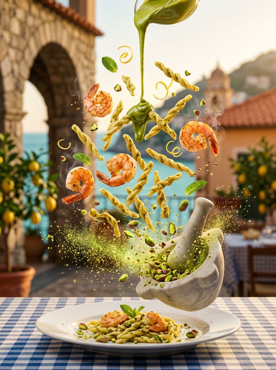
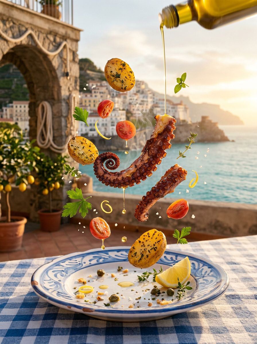
Two-column layouts break long-form content into digestible streams. The eye can rest, jump between ideas, and absorb information at its own pace.
This format excels in print-inspired web design, annual reports, and content-heavy pages where a single column would feel monotonous and overwhelming.
Columns also create implicit comparison. Place features side-by-side, contrast ideas, or simply let the reader choose which thread to follow first.
The gutter between columns is just as important as the text itself — it provides visual breathing room that makes both sides more readable.
Section Heading
Subsection Heading
Group Heading
Detail Heading
Label Heading
Inline code like font-family: monospace blends into body text while signalling technical context.
const greeting = (name: string) => {
  return `Buongiorno, ${name}!`;
};

// Amalfi Coast timezone
const timezone = "Europe/Rome";
$ npm create astro@latest
  astro   Launch sequence initiated.

$ npm run dev
  Local:  http://localhost:4321/
  Ready in 420ms
Inline Styles
Use bold for emphasis,
italic for tone and nuance,
underline for highlights, and
strikethrough for the obsolete.
Highlight & Mark
Draw attention with a highlighted phrase or use a warm accent mark for a softer callout.
Blockquote
“Good design is as little design as possible. Less, but better — because it concentrates on the essential aspects.”
— Dieter Rams
Pull Quote
Typography is the craft of endowing human language with a durable visual form.
Unordered List
- Responsive across all breakpoints
- Optimised for readability at every size
- Consistent vertical rhythm throughout
- Accessible contrast ratios on all surfaces
Ordered List
- 01. Define the typographic scale
- 02. Establish line-height ratios
- 03. Choose font pairings with intent
- 04. Test across devices and contexts
Small Text & Captions
Small text — Used for secondary information, footnotes, and supporting details that shouldn’t compete with the main content.
Caption · Mono · Uppercase · Tracking Wide
Dividers
Links
A standard inline link stands out without disrupting flow. An alternative dashed style feels more editorial.
Keyboard Shortcuts
Press Ctrl + S to save, or ⌘ Cmd + Shift + P to open the command palette.